Summary
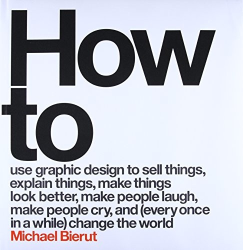
How to is Michael Bierut's account of thirty-five years of practice as a graphic designer at Pentagram, the world's largest independent design firm. The book is organized around thirty-five projects — one per year of practice — and each chapter tells the story of a single job: the brief, the process, the unexpected turns, and what Bierut took from it. The projects range from museum identity systems and political campaigns to corporate rebrands and book covers.
Bierut is a clear writer and an honest one. The chapters are not arranged to show a designer who always knew the right answer. Several projects failed, or landed differently than intended, or were hijacked by client decisions that changed what had been a good idea into a compromised one. The chapter on the Hillary Clinton 2016 campaign logo — Bierut designed it — is one of the best accounts of what it is actually like to design something that millions of people have strong opinions about, and to watch it enter a discourse the designer cannot control.
One thread running through the book is the relationship between constraint and creativity. Bierut is skeptical of the idea that the best design comes from total freedom. The most interesting work in his career has consistently emerged from difficult constraints: the need to satisfy multiple constituencies, a budget that requires simplicity, a client whose tastes are unlike your own. Constraint is not the enemy of good design but one of its productive conditions.
A second thread is the designer's relationship to meaning. Graphic design is applied art — it exists in service of something else. Bierut argues that the best designers care genuinely about the subject matter of their commissions, and that caring about content produces better form than treating every brief as an aesthetic puzzle to solve. This is not a universal view in design culture, where some traditions hold formalism above content, but Bierut makes the case with enough specific examples that it reads as hard-won rather than conventional.
Talk to How to like its author wrote you back.
Get the ideas that fit your life — not generic summaries.
- Chat with the book
- Audiobook-style main ideas
- Adapts to your life and goals
- Helps you take action
Key takeaways
- 1.
Graphic design is always in service of something else — a client, a cause, a message. Caring genuinely about that content tends to produce better form than treating every project as a purely aesthetic exercise.
- 2.
Constraint is a productive condition, not an obstacle. Many of Bierut's strongest projects emerged from tight budgets, difficult clients, or conflicting requirements.
- 3.
The designer cannot control how work is received. The Hillary Clinton logo chapter shows that a well-reasoned design decision can be swept away in a cultural context the designer neither anticipated nor caused.
- 4.
Client relationships are a form of collaboration, not a series of approvals to survive. Bierut's long career is partly a story of building trust with clients who then gave him room to work.
- 5.
Process matters more than talent at any single moment. Bierut's method is to generate many different conceptual approaches rather than commit early to the first strong idea.
- 6.
Design work lives in context it didn't create. Understanding the culture, history, and expectations surrounding a project is as important as the visual execution.
- 7.
Professional practice is long. What you learn from a failure that happens in year ten is usually more valuable than what you learn from a success in year two.
Discussion questions
Use these on your own, with a book club, or as chat starters in Superbook.
- 1.
Bierut argues that caring about the content of a commission produces better form. Can you think of examples from other fields where genuine engagement with subject matter improves the work?
- 2.
The Clinton logo chapter shows a designer watching their work enter a context they can't control. What is the designer's responsibility in that situation?
- 3.
How do you feel about constraint in your own work? Is it something you seek, something you tolerate, or something that still feels like a restriction?
- 4.
Bierut spent his entire career at Pentagram. What is the relationship between long institutional continuity and creative development?
- 5.
He describes projects that failed or were compromised by client decisions. How do you handle that kind of outcome without losing the appetite to invest fully in the next project?
- 6.
The book covers thirty-five years. Does the work you find most interesting come from the early, middle, or late chapters, and what does that suggest?
- 7.
Bierut's voice is confident but not defensive when he discusses mistakes. What does that combination require, and is it common in professional creative culture?
- 8.
The book is organized around projects rather than principles. What would a version organized around principles look like, and would it be less or more useful?
- 9.
Design work is judged aesthetically and functionally. Which of these judgments do you find more reliable, and do they ever come apart?
- 10.
Is there a meaningful difference between graphic design and other kinds of visual communication — photography, illustration, art direction? Does Bierut's account clarify or blur that?
- 11.
What kind of professional experience do you think is most effectively transmitted by a book like this, and what can only be learned by doing the work?
Themes
Frequently asked questions
-
What is How to by Michael Bierut about?
It's a career memoir organized around thirty-five specific projects — one per year of practice — each told as a story about the brief, the process, and what happened. The book is as much about professional practice and client relationships as it is about visual design.
-
Is How to worth reading if I'm not a graphic designer?
Yes, if you're interested in professional creative practice more broadly. The chapters about constraint, client relationships, and how meaning gets made and lost in the gap between design and reception apply to many fields. It's more useful as a book about professional judgment than as a technical manual.
-
How long is How to?
About 280 pages, with heavy illustration — the reading time for the text alone is around three and a half hours. The projects are well-illustrated with the actual work, which is worth spending time with.
-
Is the Clinton logo chapter a major part of the book?
It's one of the thirty-five chapters, so proportionally not dominant, but it's one of the most memorable because it puts the design decision in a context where millions of people had strong opinions. Bierut is candid about the gap between what the design was meant to do and how it was received.
-
What's the most useful idea in How to?
That caring about content produces better form. Bierut's consistent position is that a designer who is genuinely curious about the client's problem — the museum's history, the politician's message, the corporation's actual situation — will do more interesting work than one who treats every brief as an aesthetic challenge.
Similar books
Steal Like an Artist
Austin Kleon
The Creative Habit
Twyla Tharp
The Design of Everyday Things
Donald Norman
Creativity, Inc.: Overcoming the Unseen Forces That Stand in the Way of True Inspiration
Ed Catmull and Amy Wallace