Topic · 10 books
Essential Graphic design & typography reading list
Graphic design is the discipline of arranging type, image, and space to communicate ideas with clarity and force. Typography sits at its core — the choice of typeface, the setting of text, the rhythm of the page. Together they underpin everything from postage stamps to billboards to operating systems. Mastering this field means understanding not just aesthetic preferences but the structural principles that make visual communication legible, persuasive, and durable across time and medium.
- The Elements of Typographic Style
01
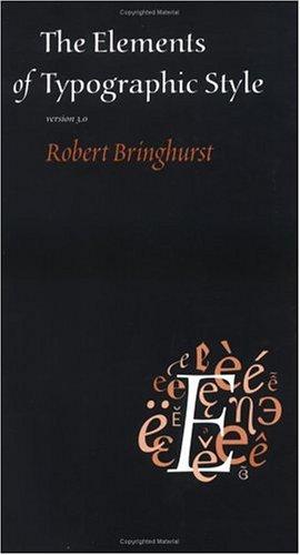
The Elements of Typographic Style
Robert Bringhurst
The foundational text on how type is set — spacing, proportion, hierarchy, the historical weight behind every decision. Designers quote it constantly; its authority comes from the depth of Bringhurst's knowledge of calligraphy, letterpress, and fine printing. Read it before any other book on this list.
- Thinking with Type
02
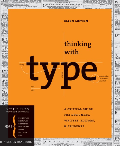
Thinking with Type
Ellen Lupton
Where Bringhurst is scholarly and comprehensive, Lupton is pedagogical and visual. She organizes the field around three concepts — letter, text, grid — and shows rather than tells. Particularly good on the micro-level decisions that separate a trained typographer from someone who just picked a font.
- Grid Systems in Graphic Design
03
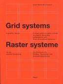
Grid Systems in Graphic Design
Josef Müller-Brockmann
The canonical account of the Swiss grid method. Müller-Brockmann lays out a structural approach to organizing the page that influenced virtually every design school curriculum from the 1960s forward. Dense and diagrammatic, best read with pencil and tracing paper in hand.
-
Read these with Superbook
Chat with any book on this list — ask questions, get answers tuned to you.
- Interaction of Color
04
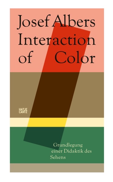
Interaction of Color
Josef Albers
Albers demonstrates that color has no fixed identity — it changes completely depending on what surrounds it. Originally a Bauhaus teaching tool using paper swatches, now available with digital plates. The lesson that every designer eventually internalizes, presented with merciless economy.
- Meggs' History of Graphic Design
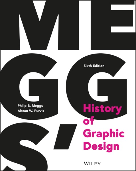
05
Meggs' History of Graphic Design
Philip B. Meggs and Alston W. Purvis
The standard survey, now in its sixth edition. It contextualizes everything else on this list — the movements, the rebellions, the technological shifts from movable type to desktop publishing to the screen. Not a book to read once but to return to as other things make parts of it click.
- The Vignelli Canon

06
The Vignelli Canon
Massimo Vignelli
A short manifesto from one of the most systematic designers of the twentieth century. Vignelli used five typefaces for most of his career and was unapologetic about it. The Canon explains why constraint produces clarity, and why semantic, syntactic, and pragmatic considerations all matter in a mark.
- How to
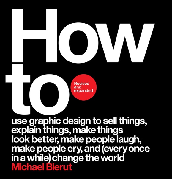
07
How to
Michael Bierut
Twenty-three case studies from Bierut's decades at Pentagram — the Saks Fifth Avenue identity, the Hillary Clinton campaign logo, the Yale School of Architecture signage. What makes these accounts valuable is his frankness about what he didn't know at the start of each project and how the solution emerged.
- Just My Type
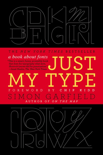
08
Just My Type
Simon Garfield
A journalist's tour through typeface history and the passions it generates. Lighter than the other books here, it serves a specific function: it reminds you how charged and contested these choices are for people who've never taken a design class. Useful calibration for anyone who designs for the public.
- Making and Breaking the Grid
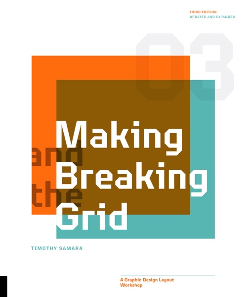
09
Making and Breaking the Grid
Timothy Samara
A systematic survey of grid structures and the conditions under which violating them becomes a design strategy rather than a mistake. Samara's taxonomy of grid types and his analysis of deconstructed layouts make this the natural companion to Müller-Brockmann — the same subject, seen from after the rule-breaking.
- Designing Brand Identity
10
Designing Brand Identity
Alina Wheeler
A practical handbook for the brand identity process from research through implementation. It grounds typographic and grid decisions in the real constraints of client work: how a logo must function at scale, in black and white, in motion. Reading it after the more theoretical books shows how principles get tested.
More about this list
The books here trace a path from fundamentals to history to practice. Start with Bringhurst and Lupton — one gives you the rules of type, the other teaches you to think through them. Müller-Brockmann and Samara bracket the grid: the Swiss master's canonical system on one side, a modern taxonomy of how and when to break it on the other.
Albers is a detour that turns out to be the center. Understanding how color actually behaves — not how we name it, but how it acts on adjacent colors — changes how you read every other design decision. Meggs then anchors all of it in historical time, showing the traditions that produced these ideas.
Vignelli and Bierut represent two generations of practice: Vignelli's austere canon of typefaces and proportions, Bierut's candid accounts of work done for real clients under real constraints. Garfield's Just My Type comes at typography from journalism rather than design school, useful for what it reveals about how type feels to a non-designer's eye.
Wheeler's handbook closes the list not as a conclusion but as a test: everything abstract becomes concrete when a client needs a mark that works at 12px and 12 feet. Reading it after the others makes you notice how the principles compound.